Books & Looks – Fashion Essentials
You hear it said by many: “Don’t judge a book by its cover.”
We all live in a world where there are countless volumes of marketing psychology, scientific analysis and tools attempting to define the use of color, positioning of images, even the fonts that we have available are structured to evoke specific emotions. This begs the question, what does a good looking book cover look like and who gets to decide?
When I began the journey of writing novels with the aim to publish I had no industry experience, none, nada. In saying this I figured I was on an equal playing field with everyone because we all initially started from the same platform of publishing virginal equitation. Hence, I was rather intentionally ignorant and maintained this across the course of the creation and design preparation of my first book. Although I had limited knowledge of the publishing do’s and don’ts, what I did hold in my favor was a long term creative exposure to photography. I knew how to frame a shot and more importantly what I liked visually that enticed me to make the shot. This insight was what I leveraged as my starting point for the cover design.
“Design is an opportunity to continue telling the story, not just to sum everything up.”
― Tate Linden
Wantin, the first book in the enigma series held many aspects which could have been reflected in the cover of the book to assist in promoting the story. Instead of going down the path of placing myself under any pressure to conform to the ideals of doing this, I opted to consider what I felt was the core essence of what I wanted to convey to potential readers.
Once I established the concept, I then searched everywhere for inspiration. Paintings, photographs, magazines, people, were all being assessed by me for design consideration. My purpose was set toward filling the visual blanks of an ideal. I was too busy writing to be caught in the process of creating the cover myself so I needed to ensure my messaging was on point to the graphic designer I engaged to assist me.
I used my phone to take snaps of things I saw that might be useful as reference for the designer. In a moment of inspiration I created a collage of random things I liked and defined what it was that I found visually attractive. After a while there was a clear pattern forming in my growing collection. This assisted me in settling the finer points of what I believed I wanted to achieve in the cover. It was time to find myself a graphic designer.
I’m a huge fan of creative collaboration so engaging a designer to work with me on the whole trilogy was something I was really looking forward to. Given my naturally unconventional approach to most things I recognized going through a directory listing graphic designers wasn’t really going to provide me with what I needed to make a decision on whom I should engage. In view of this I looked up graphic art exhibitions, competitions and shows, then attended them. There was one artist whose work I gravitated toward, which made me feel inspired. This is the person I chose to hire.
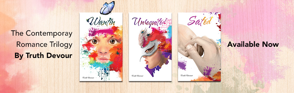
When you look at the images on the three covers you can see there is a marriage of color. The stylized water based dripping font used for the titles were selected to compliment the design but to also emphasize a few things regarding the trilogy. The cursive writing is representative of tradition (old fashioned), the bleeding of the ink told of nothing in life being perfect yet it is still beautiful. Finally, the variance in color existed because in truth nothing is every truly black and white and no two experiences are every the same.
Here is a brief breakdown of the book covers:
Wantin is the face of a child. Why? Look into her, face forward, exposed with engaging eyes. There is depth of wonderment, possibility, imagination and most importantly innocence. She is surrounded by color because life is simpler when everything is new and nothing is expected.
Unrequited depicts the character wearing a partial mask, profiled on the side the single eye revealed is cautiously aware of the environment. The peacock feathers on the mask were placed to represent the desire for attraction but the mask is the character being cautious of what she is attracting. There is less color surrounding this image and it is all concentrated in the background, alluding to her mind. The color she manifests is what surrounds her now.
Sated, two hands holding each other. Holding hands is a silent promise of forever. This may not be true for most people but in the case of the main character who does not engage in any public affection with her interludes, to hold hands for her, is significant. This needed to be the main focal point of the messaging which is why there is less color displayed on the front of the cover.
In saying all of this what does it mean to the reader who see’s my book? Absolutely nothing.
We all have our own experiences, preferences, understanding, misunderstandings in life. To try and design a cover that looks ‘great,‘ is a ludicrous concept because ‘great‘ is subjective. Sure you can follow the style guides, adhere to current trends set by other people, its all relevant and equally irrelevant. I’m not saying this to be contentious, in fact I am in full support of people being guided / inspired by what other people have done.
My only advice to aspiring writers would be: “Create a cover you would be proud to display on your wall and ensure you enjoy the process of making it.”
Blessings – Truth Devour
![]()
blog books cover design devour direct devour Enigma fashion fiction graphics ideas industry standards novels photoshop postfull trend truth
Leave a Reply Cancel reply
You must be logged in to post a comment.